¿Are you struggling to create a Divi contact us page that encourages users to fill the form and send it? If your designing skills are average, it may be something hard to achieve. And things can get even worse if you’re not experienced with Divi.
Fortunately, there are many free layouts for Divi that you can use. These are high quality designed contact us pages that can hardly be improved. They are ready-to-use layouts and can be used to learn how a nice contact us page must look like.
Let’s take a look at some of the best Divi to contact us page layouts examples.
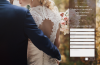
Divi Layout RIO 2016 Contact Page
Its name honors the GB success at Rio 2016 Olympics. This is a complete page layout with a header, a map and the contact form.
The header displays a full-width image with an overlaid text. After that, there is a full-width map configured to not scroll when the mouse is over it.
next is the contact form itself, which includes contact information and a styled contact form that overlaps two sections with a CSS separator.
The design is based on Rio colours, but as the rest of the elements, it can be easily changed and styled at wish.
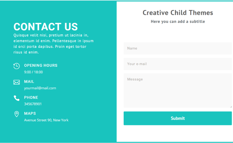
Creative Child Themes Freebies
This is a complete package that comes with two pages and 14 sectiones. It includes two contact forms layouts.
First one is a gradient form with two columns. The left column includes an action statement as text over a gradient background and on the right side, the contact form is displayed.
The second contact form is a splitted section with a blurb on the left side and all contact information. In the right side the contact form is displayed.
The design is clean and it gives a comfortably feeling. But of course, you can edit any of the sections to meet your requirements.
Free Contact Form Layouts
Free Contact Form Layouts comes with a set of four different layouts.
First one has a nice business look with two columns displaying contact information in one side and the contact form overlapping it.
Two more layouts displays an image at the left side with a same sized contact form on the other side.
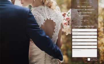
Last one uses a full-width image with a contact form that overlaps a portion of the image. The effect is very nice when overlapping form pop off the page.
The DTS Contact Page
The DTS Contact Page has a full-width background image at the top, with a three column section above it. This section is divided into ½, ¼, ¼ with map, adress and phone number in each of them. After that, the contact form is displayed.
Map height is styled with CSS and there is a customized section background that makes the contact form overlap two sections.
Typography and a clean design makes the contact form to stand out from the rest of the elements.
These are just a few examples of the best Divi contact us page layouts. Of course, you can create an awesome contact us page following your imagination.
If you master Divi like a pro, you should already know how to create an outstanding Divi contact us page.
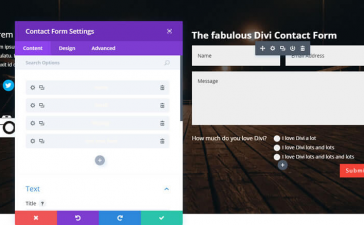
If that is not your case, here you have some more examples explained in detail about how to style Divi’s Contact Form Module.
I hope this post helped you in some way. If you liked please show your gratitude leaving a comment and sharing with your friends.